Let me share the glassmorphism prompt.
Generate UI interface for manifestation APP onboarding pages based on the following features, reference the style and create UI interface that conforms to design style and design specifications, with text in English in the interface.

## Features
"Page 1: App Onboarding Screens (3 pages total)
Core Goal: Quickly convey the APP's core value to users, guide them to start their manifestation journey with hopeful language, and create their first wish to enhance engagement.
Onboarding Page 1/3
Top Area: Blank
Core Content Area:
Main Visual: A brilliant meteor streaking across the quiet night sky, leaving a glowing trail.
Main Title (H1): Welcome to "StarWish"
Subtitle (H2): Your thoughts have the power to create reality.
Description Text: Here, we will guide you to clarify your desires, adjust your frequency, and transform your inner vision into a tangible future within reach.
Bottom Area:
Page Indicator: ● ○ ○
Action Button: Next"

## Canvas Size:
375x812 (with 1px border simulating phone frame);

## Design Style: Glassmorphism
- Glassmorphism Background:
Use semi-transparent frosted glass texture with blurred background treatment, paired with soft light and shadow effects to create a futuristic and premium feel.
- Low Saturation Color Palette:
Main color scheme uses warm off-white background with dark text (such as dark gray), complemented by orange as accent color, creating an overall sophisticated and layered color scheme.
- Minimalist Typography:
Use large, minimalist sans-serif fonts (such as Source Han Sans, Roboto, Poppins), with clear information hierarchy, distinguishing primary and secondary information through font size, weight and color to enhance visual impact.
- Form Optimization:
Remove border lines from forms and input fields, keeping only smooth rounded background to reduce visual noise and enhance the overall simplicity and refinement of the interface.
- Interactive Animation:
Add breathing animations to buttons and cards (subtle shadow or transparency changes), and slight floating effects (subtle uplift on hover) to enhance UI premium quality and interactive appeal.
But honestly, I had my doubts: was this tool only capable of one style? Would it still work if I switched things up?
With this question in mind, I decided to spend another afternoon using the exact same page functionality, only replacing different design style prompts, to see how deep its potential really goes.
Here's my complete hands-on testing record.
To be fair, I had to control the variables. For all the following style generations, I used the exact same "page functionality" and "canvas size" below, only replacing the "design style" description section.
Hand-drawn Style
When AI tools draw, the biggest fear is lacking "soul" and looking stiff. So the first challenge I wanted to try was hand-drawn style, to see how its artistic cells perform.
Here's what I found:
The hand-drawn feel here is really strong. Whether it's good UI design is debatable, but its understanding and execution of the instructions is spot-on. Look at those rough lines, irregular card edges, and paper texture in the background - they all precisely reproduce what was requested in the prompt.
This is the prompt for this hand-drawn style. When you use it, you need to change the functionality to your specific interface features.
Generate UI interface for manifestation APP onboarding pages based on the following features, reference the style and create UI interface that conforms to design style and design specifications, with text in English in the interface.
## Features
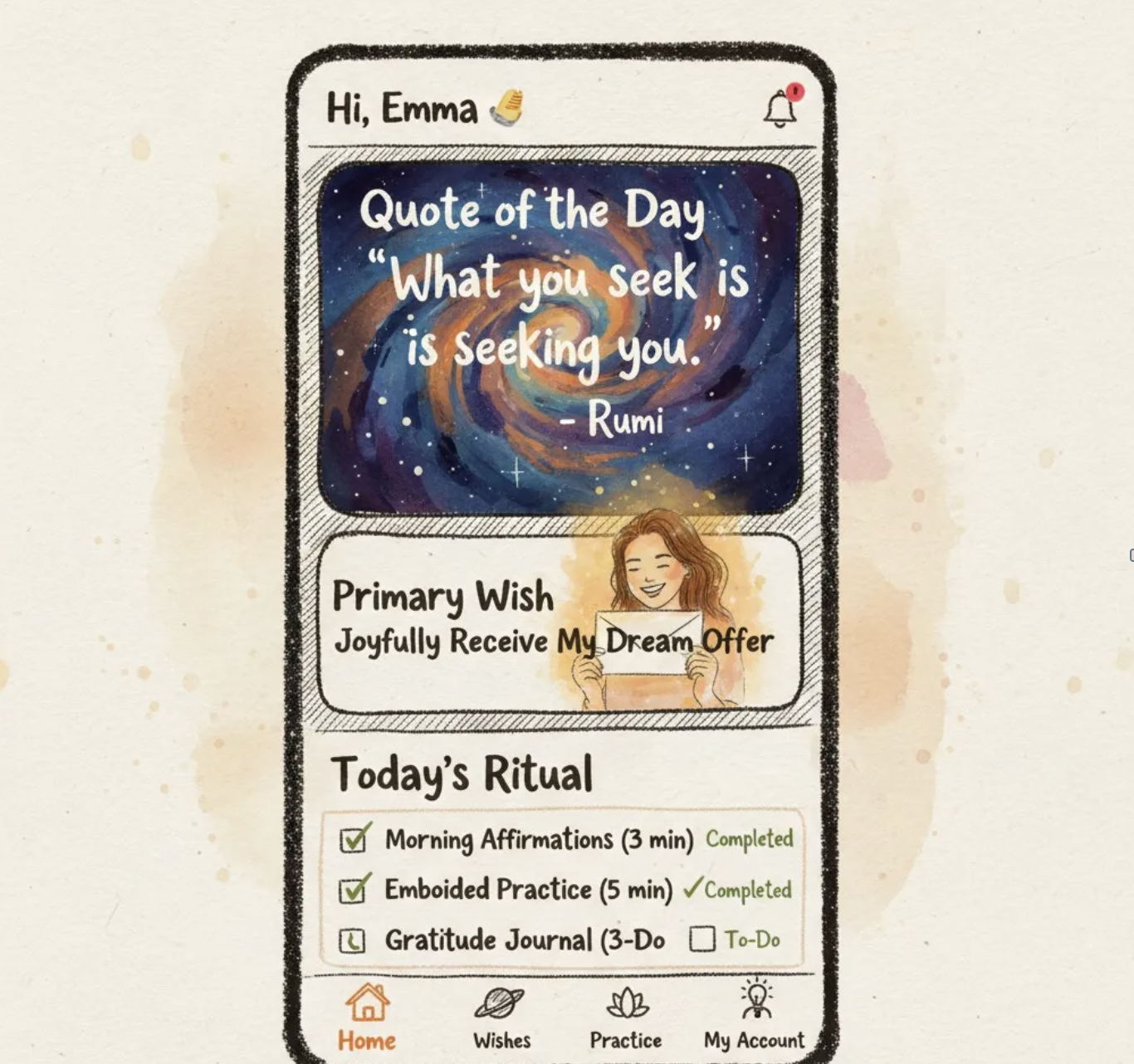
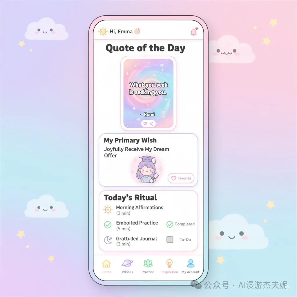
Core Goal: Become the user's daily energy center. Provide daily core guidance, quick access to practice, and intuitive display of core wish status.
Top Navigation Bar:
Left: Hi, [Username] 👋
Right: Notification icon (a small bell, shows red dot when there are new messages)
Core Content Area:
Card One: Quote of the Day
Style: Simulates tarot card style with flowing nebula background.
Content: "What you seek is seeking you." - Rumi (randomly changes daily with wisdom and energy-filled quotes)
Interaction: Tap card to bookmark or share.
Card Two: My Primary Wish
Title: My Primary Wish
Content: Display the title of the user's first or most important wish. Example: Joyfully obtaining ideal job offer
Visual: Below the wish title is a user-uploaded "vision image", displayed semi-transparently with an overlaid energy aura.
Interaction: Tap entire card to jump to wish details page.
Section Three: Today's Ritual
Title: Today's Ritual
Content: A checklist containing 3 steps, guiding users to complete daily practice.
☀️ Morning Affirmation (3 minutes) - Status: Pending / Completed ✔
🧘♀️ Feeling Practice (5 minutes) - Status: Pending / Completed ✔
🌙 Gratitude Journal (3 minutes) - Status: Pending / Completed ✔
Interaction: Tap any item to directly jump to corresponding practice function page.
Bottom Navigation Bar:
Icon 1 (highlighted): Home (house icon)
Icon 2: Wishes (planet icon)
Icon 3: Practice (lotus icon)
Icon 4: Inspiration (glowing light bulb icon)
Icon 5: Profile (personal silhouette icon)
## Canvas Size:
375x812 (with 1px border simulating phone frame);
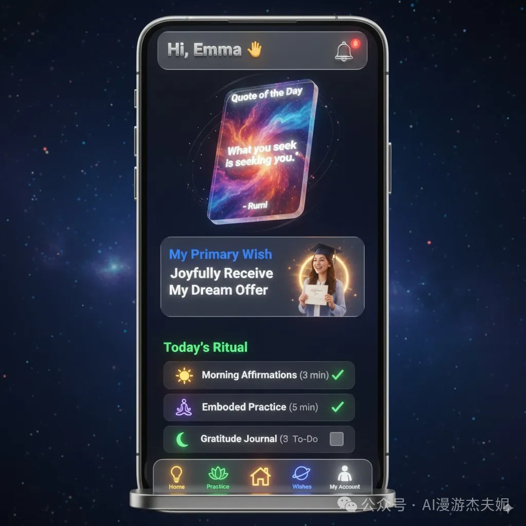
## Design Style: Bold Hand-drawn Style
**Core Concept:** Create a unique, personality-filled and handcrafted visual experience through expressive hand-drawn illustrations and organic, imperfect textures.
#### 1. **Visual Core: Hand-drawn Illustrations & Organic Forms**
* **Hand-drawn Illustrations:** The soul of interface design. Use **rough, expressive lines** (like ink, charcoal, watercolor textures) with allowance for imperfect lines and casual coloring. Applied to **splash screens, large cards, empty states, achievement badges** etc.
* **Organic Forms:** UI elements (cards, buttons) can have **slightly irregular edges or hand-drawn outlines**. Extensively use **paper, canvas textures, ink marks, watercolor bleeds** as backgrounds or element fills.
#### 2. **Background & Hierarchy**
* **Textured Background:** Overall page background in **light color (like off-white canvas #F8F4EC) but with obvious texture**, or soft, uneven warm watercolor/oil painting background.
* **Hierarchy Distinction:** Distinguish different levels through **thick line outlines, color contrast** or **simulated hand-drawn shadows** (like cross-hatching, dark ink marks), avoiding standard smooth shadows.
#### 3. **Color Scheme**
* **Dominant Colors:** **Relatively saturated, high-contrast** color combinations inspired by watercolors and oil paint pigments. For example: **Deep Blue (`#2A3A68`), Vibrant Orange (`#FF8C42`), Grass Green (`#5F7A3C`)**. Colors can have brush stroke feel or bleeding effects.
* **Background Color:** Textured light color (like off-white canvas #F8F4EC).
* **Main Text:** **Dark Brown (`#4E3B31`) or near-black (`#222222`)**, ensuring clarity.
* **Accent/Interactive Color:** Choose one **very bright and eye-catching** color (like bright yellow `#FFD700`, bright pink `#F72585`) for important reminders or interactions.
#### 4. **Hand-drawn Typography**
* **Titles/Key Labels:** Prioritize **expressive handwriting or hand-drawn style fonts**, like certain calligraphy or handwritten fonts.
* **Body Text:** Choose **slightly handwritten sans-serif** or **clearly structured serif/sans-serif**, ensuring readability.
* **Text Color:** Most text in dark colors (dark brown, near-black), small caption text can use neutral gray.
#### 5. **Forms & Interaction**
* **Input Fields:** Have **clear hand-drawn borders** (like simulated ink outlines `border: 2px solid #4E3B31;`), or borderless with obvious texture fill. Rounded corners can appear casual.
* **Focus State:** Borders thicken or change to bright accent color ink lines.
* **Animation:** Animations can **avoid extreme smoothness**, allowing **jumpy or frame animation** feel, simulating page turning, brush strokes etc. Button clicks can have slight shake, color deepening.
For design sense and artistic flair, I'd say this beats what I created with Cursor. Cursor's output felt more like "digital brush strokes," while this actually captures that authentic hand-drawn quality.
This is what Cursor generated before, you can compare:
3D Style
Next up: 3D style. This really tests how well AI understands lighting, space, and materials.
Here's what came out:
This surprised me. It actually gets what "Z-axis space" means. You can see the floating card thickness, background glow, and element shadows that create real depth. Even the 3D icons and buttons look convincing.
Here's the prompt.
Sure, some lighting details aren't perfect when you look closely, but for design drafts or inspiration, the speed and quality are impressive.
This is what Cursor generated before, feels more skeuomorphic, though it could also be that the previous prompt wasn't perfect enough:
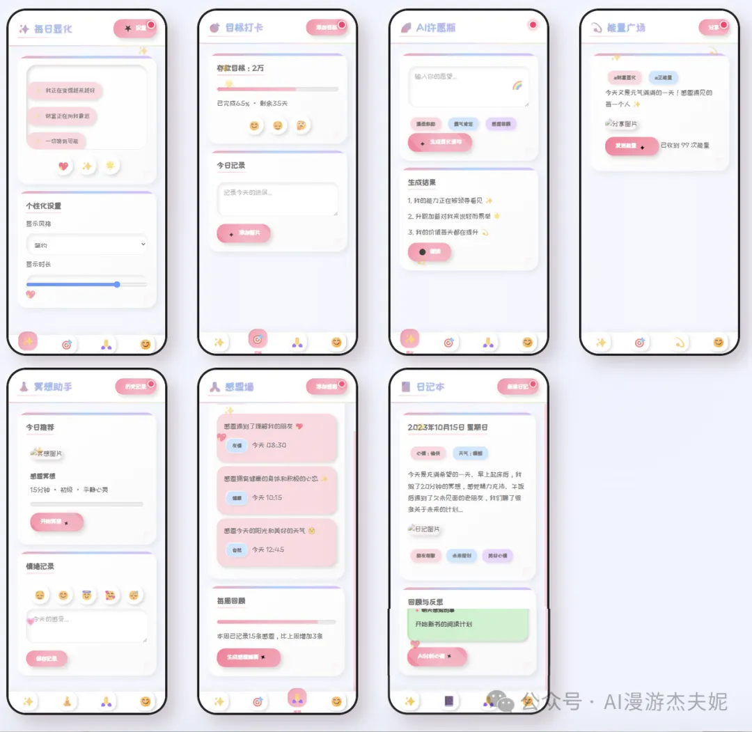
Cute Style
Let's switch gears and try something more healing. Cute style is all about capturing that "soft and adorable" feeling with rounded corners, macaron colors, and anthropomorphic icons.
Here's what the prompt produced:
The style is perfect! Large rounded corners, pastel colors, chubby icons - all the key cute elements are there, creating this incredibly sweet atmosphere. For female-oriented or healing products, using AI to quickly generate visual concepts like this is amazing.
Here's the prompt as well.
There's a small episode here: Sometimes AI-generated dimensions can drift a bit, like this image didn't strictly follow 375x812. In this case, you can directly tell it in the next conversation "Please strictly regenerate according to 375x812 dimensions," and it can usually be corrected.
Here's the previous Cursor result for comparison. In contrast, Banana's colors and textures are more delicate:
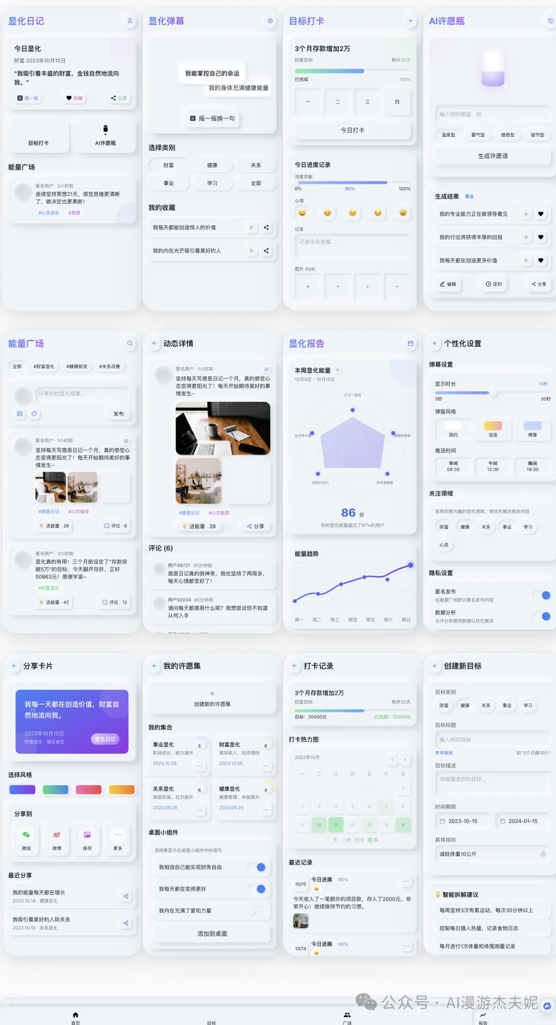
Tech/High-interaction Style
Now for something more intense. Cyberpunk style requires dark undertones, neon glow, and glass transparency - it really challenges AI's ability to handle complex visual elements.
While this isn't my personal style preference, I have to admit the result is solid. Dark background, bright neon lines, semi-transparent glass cards - these core cyberpunk elements are well integrated. The entire interface looks information-dense but maintains order through lighting effects and layout without becoming chaotic.
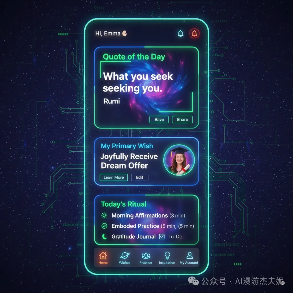
The prompt:
This one seems to be generated by Gemini before, also quite good, each has its merits:
Vibrant Clean Style
Finally, a style I really like. This design uses large color blocks contrasted with pure white background, very vibrant, but also tests color matching skills.
But it feels a bit chaotic. I think the optimization approach here would be to fix the colors to use and possibly provide reference images.
Summary
After spending the afternoon testing these 5 styles, my biggest takeaway is: AI-generated UI is becoming increasingly reliable.
The key is learning how to "direct" it. The core method is what I've been emphasizing: "modular prompts" - one part is the unchanging "functional structure," and another part is the freely replaceable "design style."
This way, you can mix and match like building blocks, quickly generating any visual solution you need.